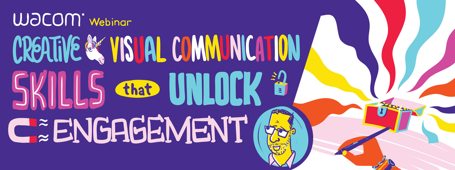
Wacom Webinar Series:
Tim May - Learn Creative Visual Communication Skills That Unlock Engagement
In today's digital age, the ability to communicate effectively is more important than ever before. By taking the time to develop your digital communication skills, you can increase your ability to:
- Engage with others
- Communicate your ideas clearly
- Collaborate more effectively
In this webinar, Tim May, an exceptionally talented digital communication expert with over 20 years of experience in visual communication and strategy, shares how to use a Wacom device to unlock engagement from an unengaged or remote audience.
Whether you’re a teacher, an artist, or a business professional, you’ll discover that by making just a few small tweaks to the way you communicate, you can create more successful and productive interactions – both in-person and online.
|
- What program are you using?
Adobe Illustrator. - What Wacom device are you using?
Wacom Cintiq Pro 16 pen display, Wacom Adjustable Stand, and Wacom Pro Pen 3D. - How do you size the artboard in Illustrator in order to work the way you are?
My answer here is not for the inexperienced Adobe Illustrator user, so beware! I used 4-5 separate illustrator canvases as a part of my presentation. Each was set-up as a wide canvas at almost the maximum width, about 22" in height to allow for large stroked lines, avoiding some of the "crunching" and "slipping" that happens when using smaller stroked lines. I've also attached a screen grab of a zoomed-out view of my canvas. I try to plan out scenes that mostly fill the screen size of my laptop.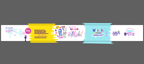
- This presentation is shown on one very long horizontal artboard. How do you send it out at the end of the presentation; as separate pages or is it saved as one long image you scroll through horizontally?
To share after the presentation, I create single-page versions of each scene in the canvas, and export them as presentations or multi page PDFs. - When offering post-meeting notes to attendees do you give them the file with the drawings / annotations or the original? I can see value to both.
When visually annotating a shared artifact for a group, I generally send out the annotated version, and often give clients a few days to add their final comments. - It's great to use contrasts - how do these presentations work with 508 compliance? Have you had to adjust presentations to make sure you comply?
Your question makes a very good point. I think every designer has had to at times sacrifice their lovely 'pink-on-crimson' layouts for the greater good of accessibility. Honestly I have not used the same degree of rigor on these presentations that I might with a client project requiring independent navigation and legibility, so thank you for helping make my presentations better! I usually test to ensure my primary colors (in this case dark purple lines and images on white, yellow, or light blue backgrounds) will pass using tools like the Web Accessibility Color Contrast Checker. - Where is the best place to start? Presentation or collaboration?
I like to begin with "orchestrated collaboration." I know that's a mouthful, but what I mean is that by creating a visual "frame" for your intended work, and THEN inviting collaborators to weigh-in, you will likely get people to give strong feedback that will help shape your presentation. This methodology also creates buy-in. I highly recommend using the visual methods you'll find in the book Gamestorming by Dave Gray, Sunni Brown, and James Macanufo. - How can visual communication be incorporated in emails?
Great question. Email is fraught with challenges. Will the recipient be able to see the visuals? Will they open the email? How much control do we have over the fonts and colors, and will it appear as-imagined in all browsers and email clients? I generally consider the beauty and visual impact of the visuals in the email as a differentiator for increasing open-rates, but email is primarily a text-based medium, so it's important to include good written descriptions of images and not to ask for too much. I will often include links in email to shared documents or whiteboards with visuals in order to garner feedback and create buy-in. - In talking about content balance (and weighting) between words and images for presentations, where does data visualization (like graphs and charts) fall?
Data visualization is important, and at times graphs and charts are needed to establish credibility and persuade an audience, in particular when information is being reported out. That said, my preference is to try to use images and illustrations to tell the human side of the story the data is pointing towards. People are drawn to people, so I try to show what the data means in terms of how the information we're sharing will affect how we work, and what we need to do about it. - How would you suggest introducing a non-traditional format presentation style like this into a very traditional organization?
Great question. I think inviting people in for some co-creation is often a good method of helping them see the value of working and presenting this way. I might recommend starting by creating a visual outline in a shared whiteboarding app like MURAL or MIRO. Invite a manager or collaborator into the space and ask them to add sticky-notes to help make the presentation more effective. Presenting from the app actually works well and delivers that sense of "Rhythm" I discussed in our webinar. - Do some organizations use an individual as the graphics communicator to capture meeting notes visually? Some of us may not be able to chew gum and draw at the same time.
In the visual consulting work I do with XPLANE for our clients, most of the time I am paired with one of our consultants who is responsible for facilitating the group and asking questions while I capture their responses visually in real time, and we are usually accompanied by a program manager who is also listening to the conversation and making sure we don't miss something important. Drawing, listening, and facilitating at the same time is not recommended.
That said, the practice of graphic recording to serve as a single set of notes for a group often proves to be valuable, and I might recommend just starting with a blank sheet of paper and a marker, and drawing out what you're getting out of a meeting to practice. You'll find that common concepts come-up repeatedly, and you can quickly build your own visual vocabulary of frequently used items. - When you started using this format was there any pushback from upper leadership in any organization you worked with? Just wondering how this would be perceived in companies that are heavy PPT - formal formats.
Most of the time, the co-creative visual process we employ helps leaders feel invested in the work and committed to helping their teams move forward with it. I remember an occasion where in the beginning of a discovery meeting, a leader inside the organization told us: "I'm not going to do any drawings or stupid design thinking crap." By the end of the session, this leader told us that we had moved farther in a single day than they had moved in the past 3 months, and this leader became a sponsor for future projects with XPLANE.
Traditional Presentations can be pretty entrenched within organizations, and in some of these instances (including working with some of the companies who created the PPT software), I think it's important to work within the culture of the organization. I recommend keeping some of the principles we outlined in the webinar in mind: Turn on Ink so you can draw on the presentation, design frames that allow space for visual notes, consider the rhythm of the presentation.

Tim May is the Creative Director at XPLANE, a design consultancy and change agency in Portland, Oregon, that helps organizations and people improve through a focus on visual communication, visual thinking, and human-centered design.
For over 20 years, Tim has been using his digital art and communication skills to help accelerate people and organizations through the change process, and at the heart of it, improve people’s work life.
Tim has a passion for helping others improve their visual communication and storytelling skills, and his techniques are a perfect fit for today’s modern workplace environment. He is a graduate of the University of Utah and studied painting at the University of Bonn in Germany.
Learn more at xplane.com
Looking to upgrade or get a new Wacom device? As a thank you for signing up for our webinar, we're offering an exclusive 10-15% off select Wacom products* at B&H through August 15th.
Use the promo code HWACOMWEB22 at checkout!
|
|
*15% off Wacom Intuos (CTL4100, CTL4100WL, CTL6100WL), Wacom Intuos Pro (PTH460, PTH660, PTH860), and Wacom One (DTC133); 10% off Wacom Cintiq (DTK1660, DTK2260) and Wacom Cintiq Pro (DTH167, DTK2420, DTH2420). Offer valid through August 15, 2022.
|
If you are interested in product and implementation strategies for your business, we're happy to help! Contact us today to speak with a Wacom specialist.
| Contact Us |
|
Wacom Webinar Series: Tim May - Learn Creative Visual Communication Skills That Unlock Engagement
In today's digital age, the ability to communicate effectively is more important than ever before. By taking the time to develop your digital communication skills, you can increase your ability to engage with others, communicate your ideas clearly, and collaborate more effectively.
In this webinar, Tim May, an exceptionally talented digital communication expert with over 20 years of experience in visual communication and strategy, shares how to use a Wacom device to unlock engagement from an unengaged or remote audience.
Whether you’re a teacher, an artist, or a business professional, you’ll discover that by making just a few small tweaks to the way you communicate, you can create more successful and productive interactions – both in-person and online. Watch the recording below.
|
- What program are you using?
Adobe Illustrator. - What Wacom device are you using?
Wacom Cintiq Pro 16 pen display, Wacom Adjustable Stand, and Wacom Pro Pen 3D. - How do you size the artboard in Illustrator in order to work the way you are?
My answer here is not for the inexperienced Adobe Illustrator user, so beware! I used 4-5 separate illustrator canvases as a part of my presentation. Each was set-up as a wide canvas at almost the maximum width, about 22" in height to allow for large stroked lines, avoiding some of the "crunching" and "slipping" that happens when using smaller stroked lines. I've also attached a screen grab of a zoomed-out view of my canvas. I try to plan out scenes that mostly fill the screen size of my laptop.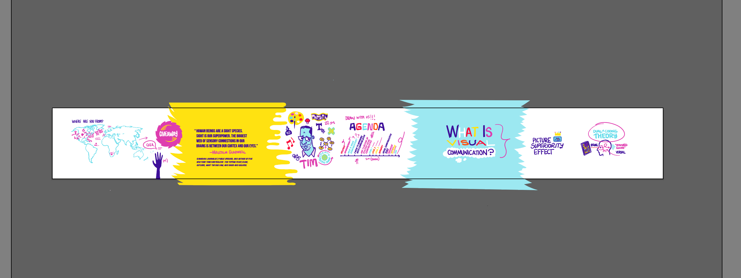
- This presentation is shown on one very long horizontal artboard. How do you send it out at the end of the presentation; as separate pages or is it saved as one long image you scroll through horizontally?
To share after the presentation, I create single-page versions of each scene in the canvas, and export them as presentations or multi page PDFs. - When offering post-meeting notes to attendees do you give them the file with the drawings / annotations or the original? I can see value to both.
When visually annotating a shared artifact for a group, I generally send out the annotated version, and often give clients a few days to add their final comments. - It's great to use contrasts - how do these presentations work with 508 compliance? Have you had to adjust presentations to make sure you comply?
Your question makes a very good point. I think every designer has had to at times sacrifice their lovely 'pink-on-crimson' layouts for the greater good of accessibility. Honestly I have not used the same degree of rigor on these presentations that I might with a client project requiring independent navigation and legibility, so thank you for helping make my presentations better! I usually test to ensure my primary colors (in this case dark purple lines and images on white, yellow, or light blue backgrounds) will pass using tools like the Web Accessibility Color Contrast Checker. - Where is the best place to start? Presentation or collaboration?
I like to begin with "orchestrated collaboration." I know that's a mouthful, but what I mean is that by creating a visual "frame" for your intended work, and THEN inviting collaborators to weigh-in, you will likely get people to give strong feedback that will help shape your presentation. This methodology also creates buy-in. I highly recommend using the visual methods you'll find in the book Gamestorming by Dave Gray, Sunni Brown, and James Macanufo. - How can visual communication be incorporated in emails?
Great question. Email is fraught with challenges. Will the recipient be able to see the visuals? Will they open the email? How much control do we have over the fonts and colors, and will it appear as-imagined in all browsers and email clients? I generally consider the beauty and visual impact of the visuals in the email as a differentiator for increasing open-rates, but email is primarily a text-based medium, so it's important to include good written descriptions of images and not to ask for too much. I will often include links in email to shared documents or whiteboards with visuals in order to garner feedback and create buy-in. - In talking about content balance (and weighting) between words and images for presentations, where does data visualization (like graphs and charts) fall?
Data visualization is important, and at times graphs and charts are needed to establish credibility and persuade an audience, in particular when information is being reported out. That said, my preference is to try to use images and illustrations to tell the human side of the story the data is pointing towards. People are drawn to people, so I try to show what the data means in terms of how the information we're sharing will affect how we work, and what we need to do about it. - How would you suggest introducing a non-traditional format presentation style like this into a very traditional organization?
Great question. I think inviting people in for some co-creation is often a good method of helping them see the value of working and presenting this way. I might recommend starting by creating a visual outline in a shared whiteboarding app like MURAL or MIRO. Invite a manager or collaborator into the space and ask them to add sticky-notes to help make the presentation more effective. Presenting from the app actually works well and delivers that sense of "Rhythm" I discussed in our webinar. - Do some organizations use an individual as the graphics communicator to capture meeting notes visually? Some of us may not be able to chew gum and draw at the same time.
In the visual consulting work I do with XPLANE for our clients, most of the time I am paired with one of our consultants who is responsible for facilitating the group and asking questions while I capture their responses visually in real time, and we are usually accompanied by a program manager who is also listening to the conversation and making sure we don't miss something important. Drawing, listening, and facilitating at the same time is not recommended.
That said, the practice of graphic recording to serve as a single set of notes for a group often proves to be valuable, and I might recommend just starting with a blank sheet of paper and a marker, and drawing out what you're getting out of a meeting to practice. You'll find that common concepts come-up repeatedly, and you can quickly build your own visual vocabulary of frequently used items. - When you started using this format was there any pushback from upper leadership in any organization you worked with? Just wondering how this would be perceived in companies that are heavy PPT - formal formats.
Most of the time, the co-creative visual process we employ helps leaders feel invested in the work and committed to helping their teams move forward with it. I remember an occasion where in the beginning of a discovery meeting, a leader inside the organization told us: "I'm not going to do any drawings or stupid design thinking crap." By the end of the session, this leader told us that we had moved farther in a single day than they had moved in the past 3 months, and this leader became a sponsor for future projects with XPLANE.
Traditional Presentations can be pretty entrenched within organizations, and in some of these instances (including working with some of the companies who created the PPT software), I think it's important to work within the culture of the organization. I recommend keeping some of the principles we outlined in the webinar in mind: Turn on Ink so you can draw on the presentation, design frames that allow space for visual notes, consider the rhythm of the presentation.
|
|
Tim May is the Creative Director at XPLANE, a design consultancy and change agency in Portland, Oregon, that helps organizations and people improve through a focus on visual communication, visual thinking, and human-centered design.
For over 20 years, Tim has been using his digital art and communication skills to help accelerate people and organizations through the change process, and at the heart of it, improve people’s work life. Tim has a passion for helping others improve their visual communication and storytelling skills, and his techniques are a perfect fit for today’s modern workplace environment. He is a graduate of the University of Utah and studied painting at the University of Bonn in Germany.
Learn more at xplane.com
|
Looking to upgrade or get a new Wacom device? As a thank you for signing up for our webinar, we're offering an exclusive 10-15% off select Wacom products* at B&H through August 15th.
Use the promo code HWACOMWEB22 at checkout!
|
|
*15% off Wacom Intuos (CTL4100, CTL4100WL, CTL6100WL), Wacom Intuos Pro (PTH460, PTH660, PTH860), and Wacom One (DTC133); 10% off Wacom Cintiq (DTK1660, DTK2260) and Wacom Cintiq Pro (DTH167, DTK2420, DTH2420). Offer valid through August 15, 2022.
If you are interested in product and implementation strategies for your business, we're happy to help! Contact us today to speak with a Wacom specialist.
| Contact Us |
|
Copyright © 2022 Wacom. All Rights Reserved. All other trademarks are the property of their respective owners and are used with their permission.